The color plate section of the book can now be found here.
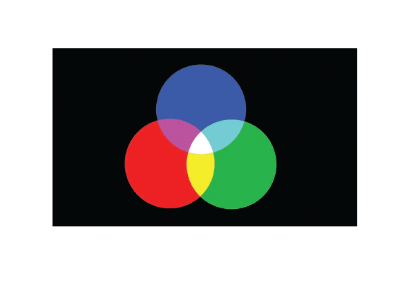
Color Plate 01
Red, green and blue are the three primary colors of light, a system called additive color. You can create any other color of light by mixing these primaries together, and if you mix enough light together, you eventually get white.
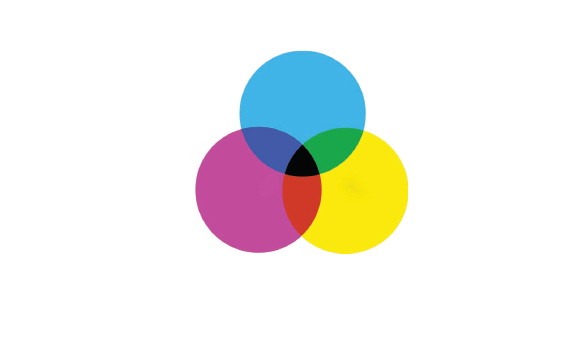
Color Plate 02
In a subtractive color system, mixing the colors together results in black.
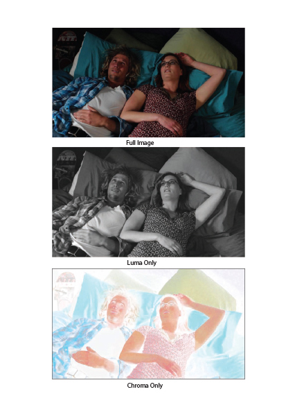
Color Plate 03
A full-color HD image (top) consisted of luma (middle) and chroma (bottom). In this example, you can see that most of the important image information is contained in the luminance channel.
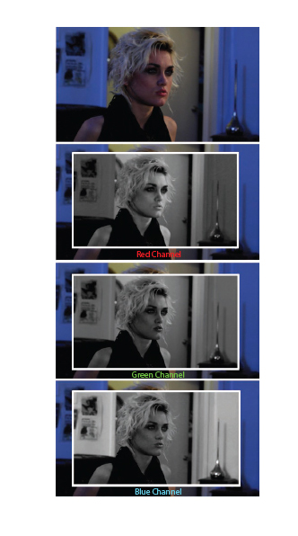
Color Plate 04
The color in a video image (top) is comprised of a red channel (R), a green channel (G), and a blue channel (B). Note the difference in her lips and the shadows on her face across the RGB channels.
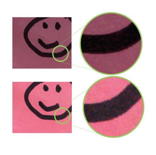
Color Plate 05
Same happy face, same PostIt note. Increasing the gain (lower image) yields better exposure but introduces noise.
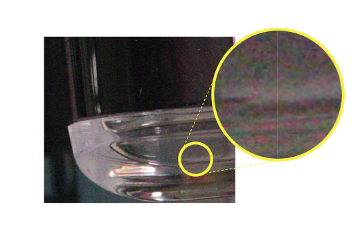
Color Plate 06
This object is almost monochrome, but due to heavy gain boosting, chrominance noise, consisting of brightly colored pixels, is introduced.
Color Plate 07
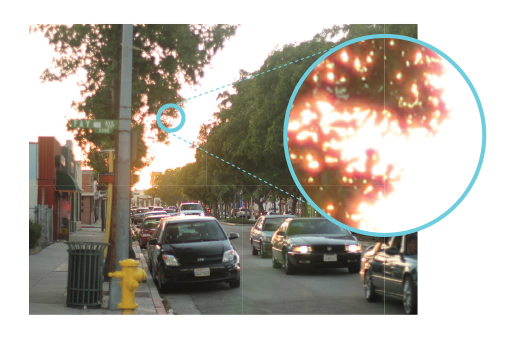
Chromatic aberration looks like a colorful halo or fringe between dark and light areas in an image. Instead of a clean edge, the leaves in this image are fringed with red and yellow tones.
Color Plate 08
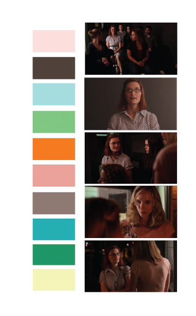
This color pattern was inspired by the images to the right and used to communicate ideas about the look of the film to the art director, costume designer, and others.
Color Plate 09
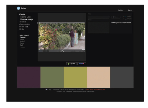
The Adobe Kuler website automatically creates a color palette using an uploaded still photograph.

Color Plate 10
This color palette was inspired by a location scout photograph of an old classroom.
Color Plate 11
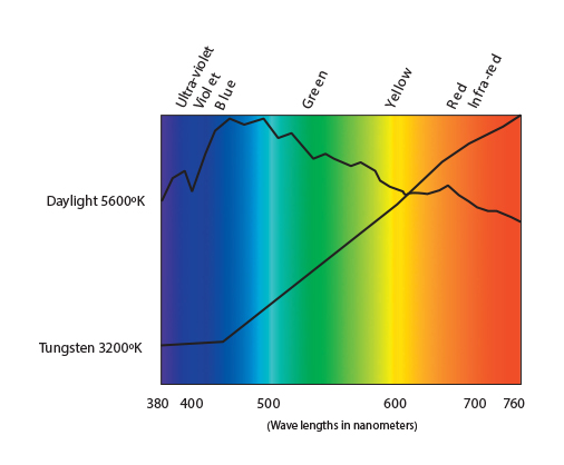
This chart shows the visible color spectrum and the spectral energy distributions of sunlight and tungsten light. Both cover the entire range of color, but sunlight has much more blue, whereas tungsten has more red.
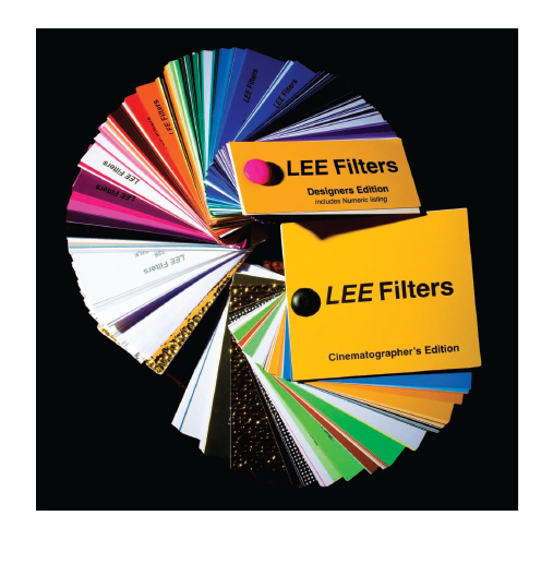
Color Plate 12
There is a huge selection of colored lighting gels, reflectors, and diffusion materials available. Swatch books like this one from LEE Filters are great to have on hand as you plan the lighting for your project.
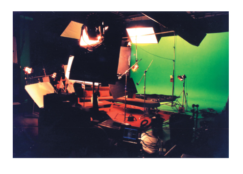
Color Plate 13
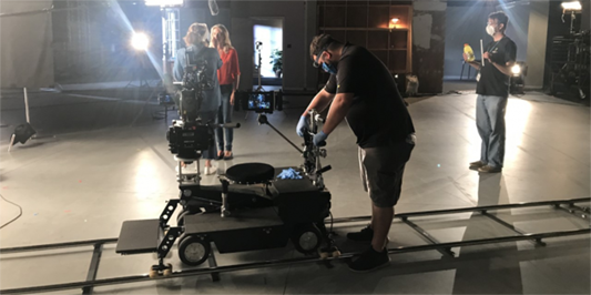
Lighting crews use a lot of equipment to light the green background on this green screen set.
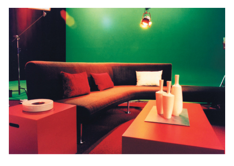
Color Plate 14
This green screen set was lit and art-directed to match a CGI environment.
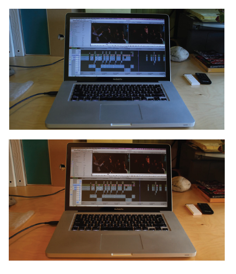
Color Plate 15
The image on the top has the white balance set for fluorescent interior light, but there is a window to the right, out of frame, so the best choice is to set the white balance for daylight (bottom).

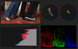
Figure 10.20 A well-exposed image show in standard, HSL vectorscope, YUV vectorscope, parade (RBG) waveform, and histogram views (clockwise from upper left).

Color Plate 16
This actor was recorded against a blue-screen backdrop (left) and the background image (middle) was keyed in to get the composite image (right). For this particular composite, the goal was to blend a modern day video image of an actor with colorized film footage from the 1920s.
Color Plate 17
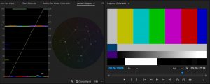
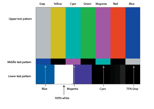
The SMPTE color bars image contains three test patterns that are designed to calibrate color on NTSC monitors.
Color Plate 18
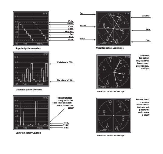
The waveforms (left) and vectorscopes (right) that correspond with the SMPTE color bars test patterns.

Color Plate 19
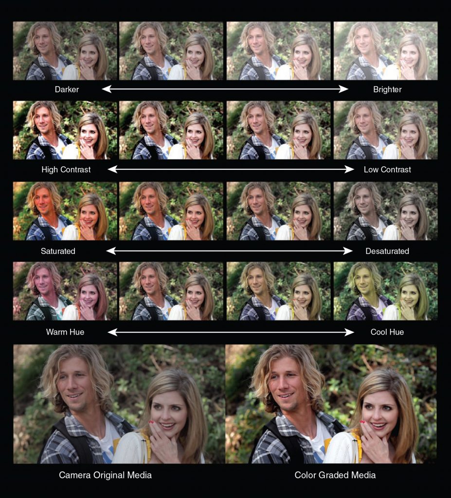
The four basic elements of color correction: brightness (aka lightness), contrast, saturation, and hue.

Figure 16.1 The four basic elements of color grading: brightness (aka lightness), contrast, saturation, and hue. See also Color Plate 19.
Color Plate 20
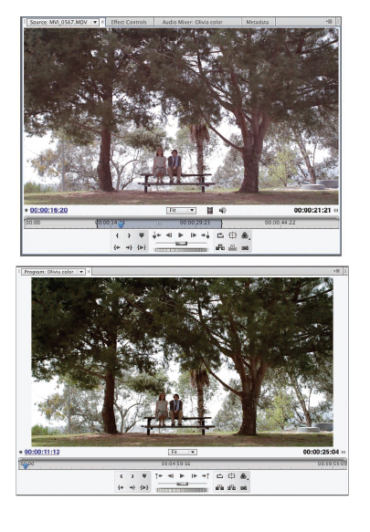
This image had a lot of red in it. After adjusting the luminance, we boosted the greens and diminished the reds to make the landscape stand out.
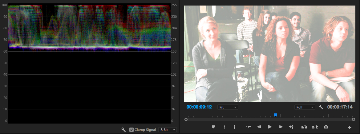
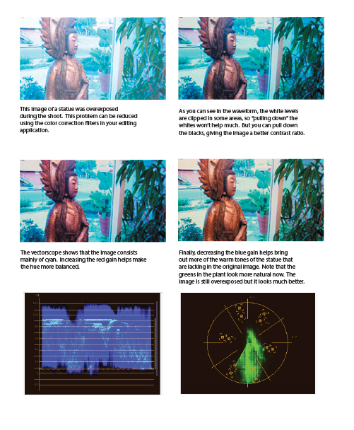
Figure 16.7 The waveform of this image shows that it’s too bright. (See also Color Plate 21.)
Color Plate 21
A very overexposed image and our steps for correcting it.
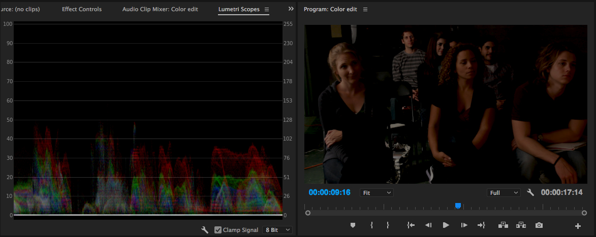
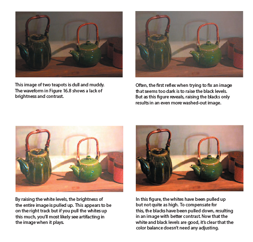
Figure 16.8 The waveform of this image shows that it’s too dark. (See also Color Plate 22.)
Color Plate 22
A very underexposed image and the steps for correcting it.
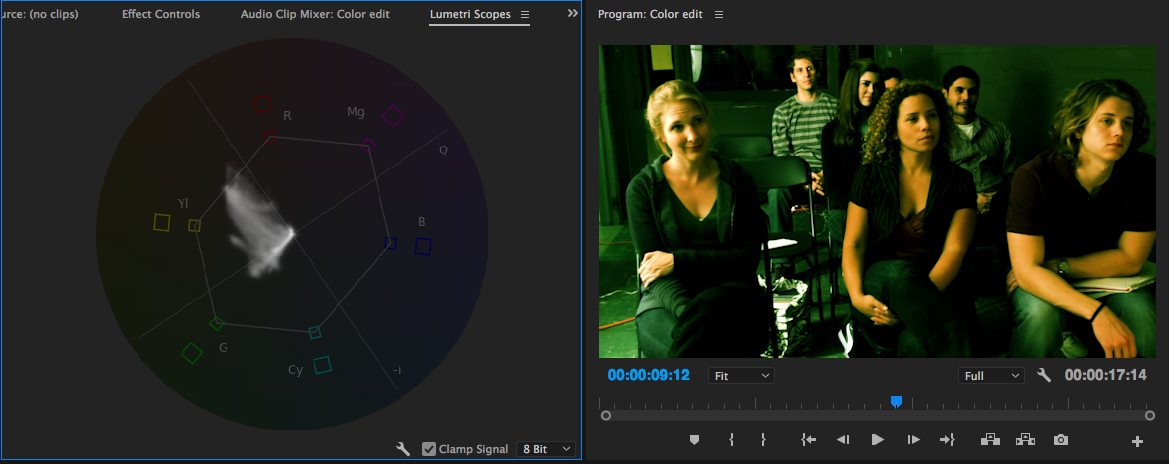
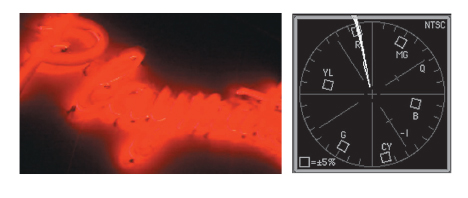
Figure 16.9 The vectorscope of this image shows that the green is oversaturated.
Color Plate 23
This red neon sign is oversaturated, which is a common problem with neon lights.
Color Plate 24
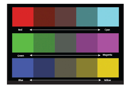
Complementary colors in the additive color system.
Color Plate 25
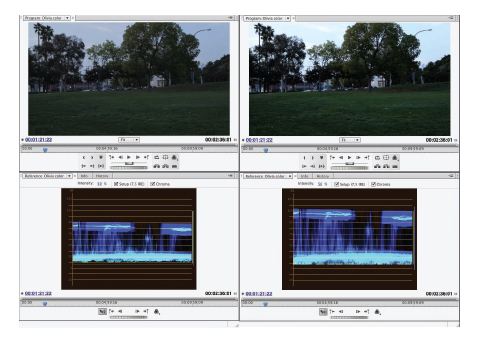
The waveform of the original image (left) shows that the luminance range is crushed. After the luminance is adjusted, the waveform of the image on the right shows a healthy range from black to white.
Color Plate 26
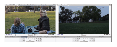
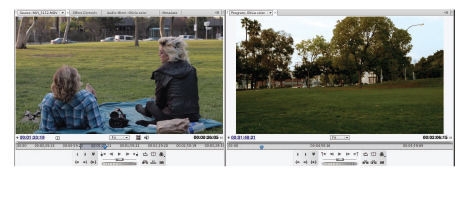
These shots don’t match, due to quickly fading daylight conditions during the shoot.
Color Plate 27
The final color-corrected image matches the other shot surprisingly well. We increased the reds and greens and decreased the blues to create a more saturated image that favors the reddish-yellow sunset colors in the rest of the scene.
Color Plate 28
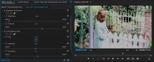
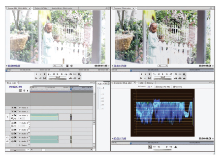
The original image (upper left) is severely overexposed. The corrected image (upper right) is much better looking, but some areas are not fixable. Note the area around the white picket fence near the bottom of the frame. The clipped whites are still visible in the waveform of the corrected image (lower right).
Color Plate 29
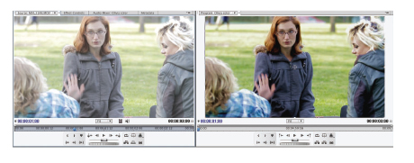
This image is overexposed (left) but correctable (right).
Color Plate 30
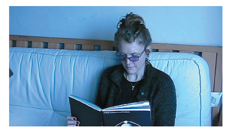
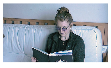
This shot has bad white balance (see Chapter 16, p. 437). Note the overall blue cast to the image.
Color Plate 31
The final image with corrected white balance.
Color Plate 32
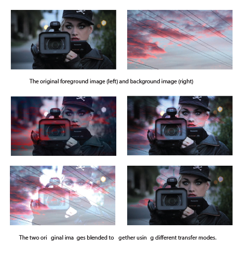
Transfer modes can create unique color effects.
Color Plate 33
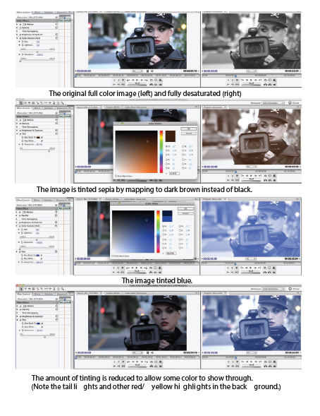
Tinting can produce a variety of monochrome looks.
Color Plate 34
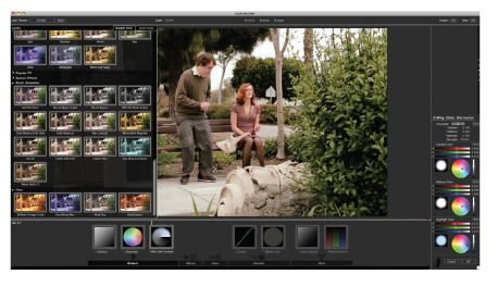
Film look presets (left) in the Red Giant Magic Bullet Looks interface.
Color Plate 35
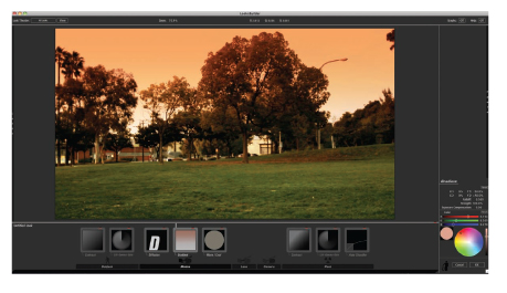
Another way to create a sunset: the sunset gradient in Magic Bullet Looks.
Color Plate 36
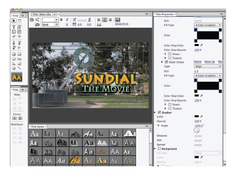
We chose to keep this title as separate from the background as possible by using brightly colored text, full opacity, and drop shadows. Shown here, the title tool in Adobe Premiere Pro.
Color Plate 37
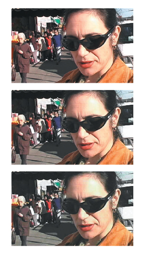
Our original image (top) was compressed three times (middle) and then six times (bottom) to show the effects of too many roads of compression with a lossy codec.
Color Plate 38
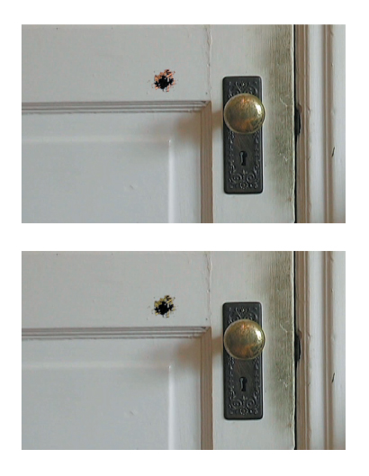
When compositing, you’ll frequently need to apply color correction techniques to blend one layer into another. Here, we used Color Balance and Blur filters to better integrate the bullet holes into the door.
Color Plate 39
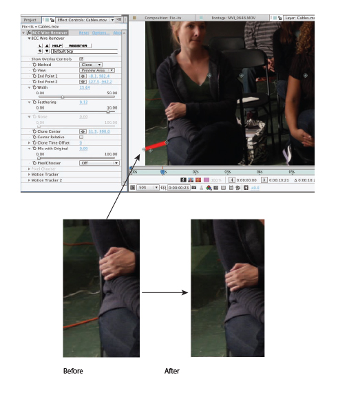
Boris FX Continuum Wire Removal plug-in lets you choose different ways to paint out a wire and also track motion within the shot (before and after inset).
